import yfinance as yfimport mplfinance as mpfimport pprintyticker = yf.Ticker("MSFT")df = yticker.history(period="1y") # max, 1y, 3mo, etcmpf.plot(df, type='candle', style='charles', volume=True)
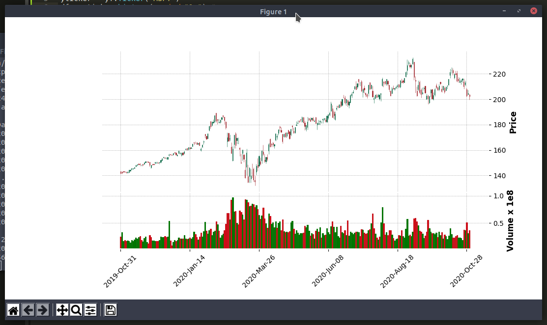
NOTE: There are controls to zoom in on particular section of the chart
❤️ Is this article helpful?
Buy me a coffee ☕ or support my work via PayPal to keep this space 🖖 and ad-free.
Do send some 💖 to @d_luaz or share this article.
✨ By Desmond Lua
A dream boy who enjoys making apps, travelling and making youtube videos. Follow me on @d_luaz
👶 Apps I built
Travelopy - discover travel places in Malaysia, Singapore, Taiwan, Japan.